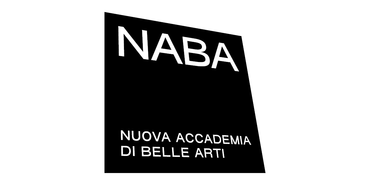
NABA is pleased to present its new brand identity, involving logo, coordinated image, a new website and a dedicated advertising campaign.
A restyling of its visual identity born with the aim of renewing and reinterpreting the shapes and the typography of the previous logo, keeping in mind some of its characteristics that have been blended within the research of a contemporary, wearable vibe, not only in a metaphorical way.
NABA’s new visual identity’s design has been conceived by FIONDA, a visual communication and art direction agency that mainly deals with project of cultural and social nature (just like the recent update of the international fair of contemporary art Artissima’s visual identity). Based on a research that focuses on the Academy’s intrinsic dynamicity, the new visual identity experiments with shapes, movement and spatial flexibility. NABA, Nuova Accademia di Belle Arti seeks to position itself in its cultural horizon as a reality that always moves forward, on both national and international level.
To launch this new image, FIONDA also created a dedicated advertising campaign, with a concept inspired to the creative process that embodies the Academy’s spirit, ironically simulating some scenarios of artwork creation, coming to life: a real voyage going behind the scenes of two students’ imaginary projects, as hybrid and multidisciplinary as curious and particular.
The campaign also presents the new claim Made in NABA that translates itself graphically in a small circled N as a substitute of the classic copyright circled C, to communicate the Academy’s recognized and recognizable identity.