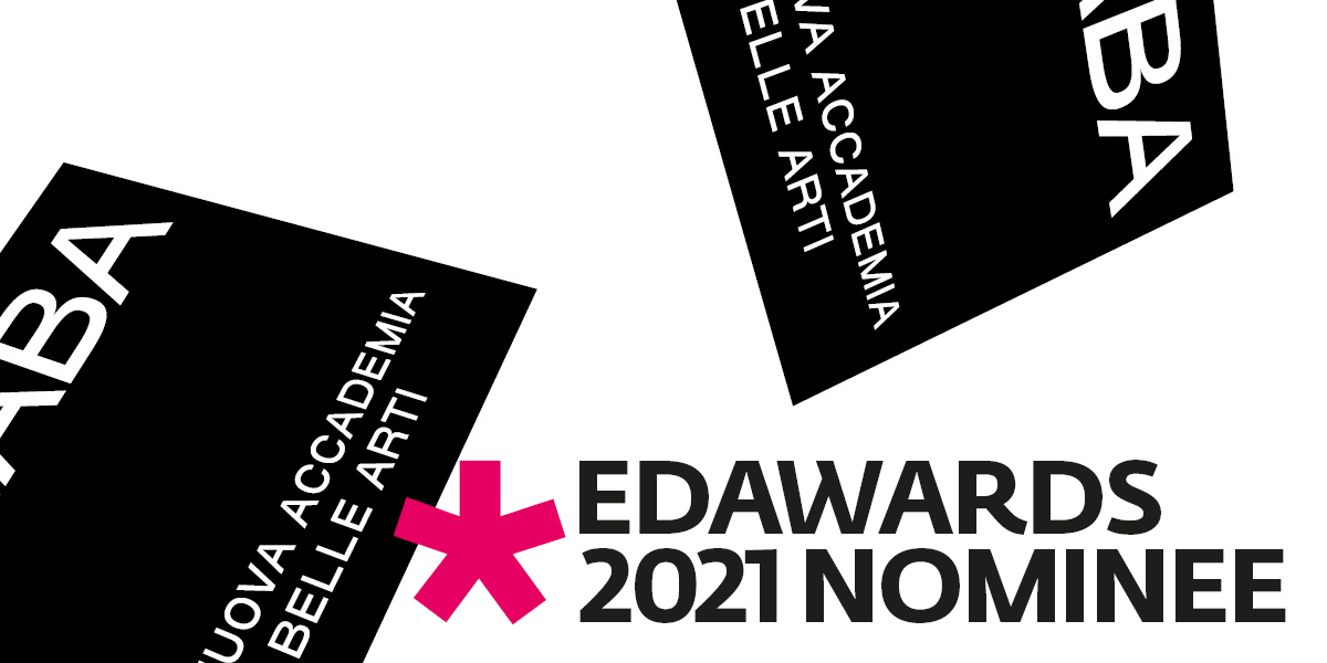
NABA proudly announces that its new brand identity, launched in September 2020 that starting with the redesign of the logo involved the entire visual identity system of the Academy, including the advertising campaign, has been selected as finalist in the Branding - Integrated Identity Applications category of the prestigious European Design Awards 2021.
The European Design Awards is the comprehensive annual awards organisation celebrating the best of graphic design, illustration and digital design in Europe, and are the joint effort by 15 communication design magazines from across Europe.
NABA’s new visual identity’s design, conceived by FIONDA, the visual communication and art direction agency based in Turin, under the guidance of its creative director Roberto Maria Clemente, is based on a research that focuses on the Academy’s intrinsic dynamicity, the new visual identity experiments with shapes, movement and spatial flexibility, starting from a sense of "openness", of a window to the outside, which was one of the founding elements. The restyling of its visual identity is born with the aim of renewing and reinterpreting the previous logo, blending some of its characteristics within the research of a contemporary wearable vibe. NABA seeks to position itself in its cultural horizon as a reality that always moves forward, on both national and international level.
To launch this new image, FIONDA also created a dedicated advertising campaign, with a concept inspired to the creative process that embodies the Academy’s spirit: a real voyage going behind the scenes of two students’ imaginary projects, as hybrid and multidisciplinary as curious and particular. The campaign also presents the new claim Made in NABA that translates itself graphically in a small circled N as a substitute of the classic copyright circled C, to communicate the Academy’s recognized and recognizable identity.